
Newsletter
Week Ending April 10th 2026
Market recap
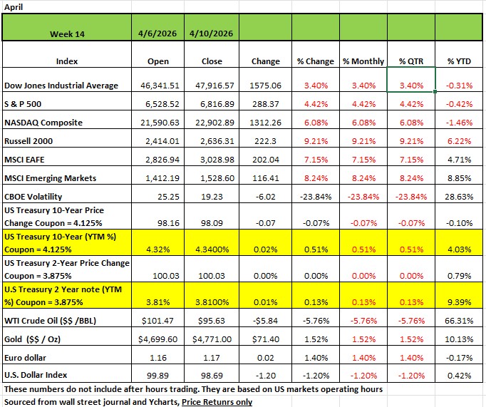
To say that the markets are volatile would be an understatement. At the end of Q1 (march 31st) all the major indices were down. The DOW and S&P 500 were down more than -5% on a YTD basis. This after both indices hitting all-time highs in February. As of Friday, all indices are almost at breakeven for the year just down a few basis points YTD The Rissell 2000 had the largest gain last week gaining +9.21% followed by the NASDAQ at +6.08% the S&P500 +4.42% and the DOW up +3.4%. All markets moved mostly on Wednesday ahead of high-stakes peace talks between Iran and the US and a positive outlook on the beginning of Q1 earnings reporting season.
A two-week ceasefire reached between the US and Iran earlier last week appeared to be holding as officials from Washington (J.D. Vance) and Tehran (Parliament Speaker Mohammad Bagher )were meeting over the weekend in Pakistan, which helped broker the ceasefire. However, as of this writing peace talks seemed to have failed and no one knows what may happen next.
This coming week also marks the unofficial start of the Q1 earnings reporting season. US consumer sentiment hit the lowest on record this month, reflecting heightened worries about higher prices and the overall economic fallout from the Middle East conflict, according to the University of Michigan's preliminary April survey. The survey was largely completed before the announcement of the two-week ceasefire. A report by the Bureau of Labor Statistics showed US consumer inflation accelerated to its highest monthly reading in nearly four years in March as the Middle East conflict sent energy prices sharply higher. The data showed energy price growth jumped about 11% sequentially in March, led by a 21% surge in gasoline, accounting for nearly three quarters of the headline increase.
By Sector
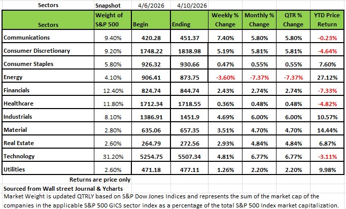
Every sector other than energy rose last week. Communication services +7.4% and Consumer discretionary climbed +5.1% each, followed by a +4.8% gain in technology and a +4.7% advance in industrials. Materials were also strong, up +3.5%, while Real Estate and Financials both rose more than +2% each. Utilities, Consumer Staples and Healthcare also edged higher by less than 1%. Amazon.com (AMZN) was the top performer in consumer discretionary, climbing +13%. The company said its Amazon Web Services' artificial intelligence revenue run rate was more than $15 billion in Q1 and "ascending rapidly." AWS has the potential to grow even faster, Amazon Chief Executive Andy Jassy said in a letter to shareholders. Paramount Skydance (PSKY) had the largest percentage increase in communication services, rising 11.5%. The company's $54 billion bridge loan backing its acquisition of Warner Bros. Discovery (WBD), provided by Bank of America (BAC), Citigroup (C), and Apollo Global Management (APO), has been sold down to wider group of banks and reduced to $49 billion, according a regulatory filing.
Intel (INTC) led the advance in the technology sector, jumping +23%. Intel and Alphabet's (GOOG, GOOGL) Google expanded a multiyear agreement to develop artificial intelligence and cloud infrastructure using Xeon processors and custom infrastructure processing units. Intel's Xeon chips will continue to support Google Cloud systems across AI, inference and general computing workloads, the companies said.
Energy, the lone sector in the red for the week, fell -4.1%.Phillips 66 (PSX) led the energy sector's drop, sliding -9.6%, as the company said its Q1 results are expected to be weighed down by $900 million in mark-to-market losses tied to surging commodity prices, according to preliminary data. The jump in commodity prices also led to a net outflow of almost $3 billion of cash collateral on derivative positions, Phillips 66 said in a regulatory filing.
Earnings reports are expected this week from many large companies, including Goldman Sachs Group (GS), JPMorgan Chase (JPM), Johnson & Johnson (JNJ), Wells Fargo (WFC), Citigroup (C), BlackRock (BLK), Bank of America (BAC), Morgan Stanley (MS), Progressive (PGR), Netflix (NFLX), Pepsico (PEP), Abbott Laboratories (ABT) and Charles Schwab (SCHW). Economic data will include the March producer price index as well as March existing home sales, import prices, industrial production and capacity utilization, among other reports.
Understanding Risk, Probability
The Ghost in the Curve:
The Fat Tail Trap:
Most people define risk the same way: the chance of losing money. It's intuitive, it's clean, and it's incomplete. The investment industry defines risk more broadly — the probability of not achieving your expected return. That distinction matters more than it sounds, because it forces us to think about outcomes in both directions, not just the catastrophic ones.
With that framing in mind, this week I want to spend some time on a topic that I think is persistently misunderstood — even among experienced investors: how we actually measure risk, and why the standard mathematical model most of us rely on can quietly mislead us when it matters most.
The Bell Curve: Elegant, Useful, and Sometimes Dangerous
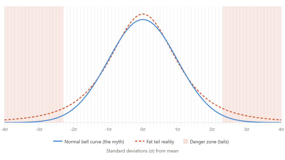
The Normal Distribution — the famous Bell Curve — is the workhorse of modern finance. It underpins how we calculate volatility, how portfolio risk is modeled, and how "worst-case scenarios" get defined. Its appeal is its symmetry: most outcomes cluster around the average, and extreme events become exponentially less likely as you move out toward the edges.
In a perfectly normal market, about 68% of daily returns fall within one standard deviation of the mean. Roughly 95% fall within two. And 99.7% fall within three. That sounds like a tight, predictable world.
Here's the problem: a 20% market decline — the threshold that defines a bear market — would qualify as a 6- or 7-sigma event under the normal distribution. The mathematical odds assigned to it are, for all practical purposes, zero. Yet investors who lived through 1987, 2001, 2008, or 2020 and 2022 know these events don't come once every few centuries. They come roughly once every six to seven years.
That gap between the model and reality has a name.
The Fat Tail: Where Real Risk Lives
Markets are leptokurtic — a statistical term meaning their return distributions have a taller peak, thinner mid-range, and much heavier tails than the normal curve predicts. The center is calmer than expected, but the extremes are far more common. Crashes and violent rallies aren't anomalies in a fat-tailed distribution. They're features.
The chart above illustrates this visually. The blue line is the normal curve — notice how aggressively it tapers toward zero at the edges. The dashed orange line is the fat-tailed reality. The shaded zones represent what standard models dismiss as near-impossible territory. But history fills those zones on a regular basis.
There are several practical implications here:
First, standard deviation measures movement in both directions. It captures upside volatility just as much as downside volatility. That's fine for academic modeling, but it's not what most investors actually care about. Downside deviation — which measures only the negative swings — is the more intuitive risk metric for most portfolios. Unfortunately, it isn't always front-and-center in how performance is reported.
Second, volatility is not constant. The standard deviation used to define the bell curve is static by assumption. But in real markets, volatility spikes sharply during stress and compresses during calm. The "fat tail" is often just a consequence of this volatility regime-switching — something the static model structurally cannot capture.
Third, bell curve models don't just underestimate frequency; they underestimate magnitude. Once you move past the predictable center of the distribution, there is no known ceiling on how bad a tail event can get. A 20% decline can be the opening act of a 40% collapse. It does not always happen in a single day.
Two Ways to Measure a 20% Drop (And Why It Matters)
When we talk about a bear market, the starting point is everything.
The standard definition measures from the 52-week high — a peak-to-trough decline of 20% or more. This is cycle-dependent and doesn't care about the calendar. It captures the worst-case experience for someone who bought at the top. Historically, these events cluster and accelerate after a high is set. They are common, documented, and cyclically inevitable.
The year-to-date measure is a different animal.
A -20% YTD reading means the market is 20% below where it started the year on January 1st. This is frequently used in media coverage and advisor reporting, but it can be deeply misleading. If the market surged 15% in the first half of the year before collapsing 35%, it's in a technical bear market by the peak-to-trough definition — but might only show -8% YTD. The calendar constraint masks real damage.
Path dependence is also critical here. High volatility events cluster. If we're already down 5% by February 1st, the probability of hitting -20% by year-end is not simply 1-in-10. Prior volatility significantly raises the probability of further volatility — a concept the standard bell curve, with its static assumptions, simply ignores.
What This Means for Your Portfolio
I'm not raising these points to suggest markets are always on the edge of catastrophe. Most years, the bell curve works just fine. The problem is that the years it fails are precisely the years when your financial plan is most exposed. Relying on a model that assigns near-zero probability to 6-sigma events means you're not preparing for the only events that can genuinely derail a long-term wealth plan.
A few practical takeaways I keep returning to:
The 200-day simple moving average remains one of the cleanest early-warning indicators when markets begin shifting from distribution to trend decline. When price breaks below that level on sustained volume, the character of the market has changed — not just the mood.
For clients building or holding concentrated equity exposure, thinking about downside deviation — not just standard deviation — gives a more honest picture of real portfolio risk.
And when someone tells you a market event has "never happened before" or is "statistically impossible," that's usually a description of a bell curve assumption, not market reality. The fat tail doesn't ask permission.
As always, the goal of this commentary is to provide context for how I'm thinking about markets and risk. This is not a recommendation to buy, sell, or hold any specific security. Please reach out if you'd like to discuss how any of these themes apply to your specific situation
The Week Ahead
Late last week, Iran said that its frozen assets in foreign banks must be released and that a ceasefire in Lebanon must be established before peace talks could proceed, casting doubt on U.S.-Iranian negotiations scheduled for over the weekend in Pakistan. Israel had expressed willingness to negotiate with Lebanon, but the two countries continued to exchange strikes on Friday, keeping global markets on edge. This week is light on economic data, so developments in the Middle East and oil prices are likely to set the tone again. U.S. investors’ attention will turn to the beginning of first quarter earnings season to see how business outlooks might be affected by the war. Most of the major U.S. banks will report along with technology companies ASML Holdings, Taiwan Semis, and Netflix. The domestic economic calendar includes producer prices, existing home sales, industrial production figures, and regional manufacturing surveys. There will be many appearances by FOMC members throughout the week. On the international side, China reports Q1 GDP and monthly industrial production, and retail sales numbers on Wednesday evening. None of those data points are likely to reflect the full impact of the Iran war. The International Monetary Fund’s bi-annual meeting convenes in Washington amid high uncertainty and volatility for global economies. Australia’s employment report and the UK’s GDP update round out the calendar